

DISCIPLINE — VISUAL
Edacy - Visual Direction
STACK
- Figma
- Adobe Illustrator, photoshop
- HTML / CSS / JavaScript
- Aws
- UX/UI Design
THE GAZE
I saw Edacy as more than a learning platform. It is a bridge between talent and opportunity across Africa.
My visual approach was to create an identity that feels ambitious, credible, and accessible at the same time. The challenge was to represent advanced technology and professional growth without adopting the cold aesthetics often associated with global tech companies.
The visual language had to reflect both rigor and optimism: a platform preparing the next generation of African builders, designers, product leaders, engineers, and entrepreneurs.
THE PROCESS
The visual direction was built around a simple principle: clarity creates confidence.
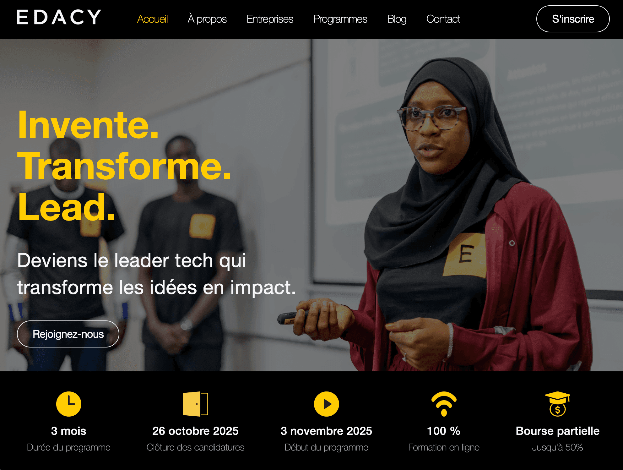
I developed a design system that combines strong typography, bold contrasts, and a restrained color palette to make information easy to navigate and understand. Every visual decision was made to support learning and progression.
The identity relies on clean layouts, generous spacing, and authentic imagery that highlights real people, real projects, and real outcomes. Rather than relying on generic stock imagery, the visual narrative focuses on learners, mentors, and professionals actively building the future of Africa's digital economy.
The system was designed to work seamlessly across bilingual experiences, digital platforms, marketing campaigns, presentations, and educational content.
THE RESULT
A cohesive visual ecosystem spanning web, learning experiences, marketing campaigns, presentations, and talent acquisition initiatives. The visual identity helped strengthen Edacy's credibility, increase engagement with learners and partners, and support its expansion across multiple African markets.
THE RESONANCE
Edacy's visual identity communicates possibility.
The combination of bright yellow, black, and turquoise creates a distinctive presence that feels energetic, optimistic, and forward-looking. The visual language signals that learning is not only about acquiring knowledge, but about gaining access to new opportunities, careers, and ventures.
The result is an identity that resonates with ambitious professionals while remaining deeply connected to the African context it serves.