

DISCIPLINE — VISUAL
Soin-reflex Visual Direction
STACK
- HTML · CSS · JavaScript
- Google Apps Script
- Google Sheets CMS
- Sanity
- OneDoc
- Custom photography & video
- Brand assets
THE GAZE
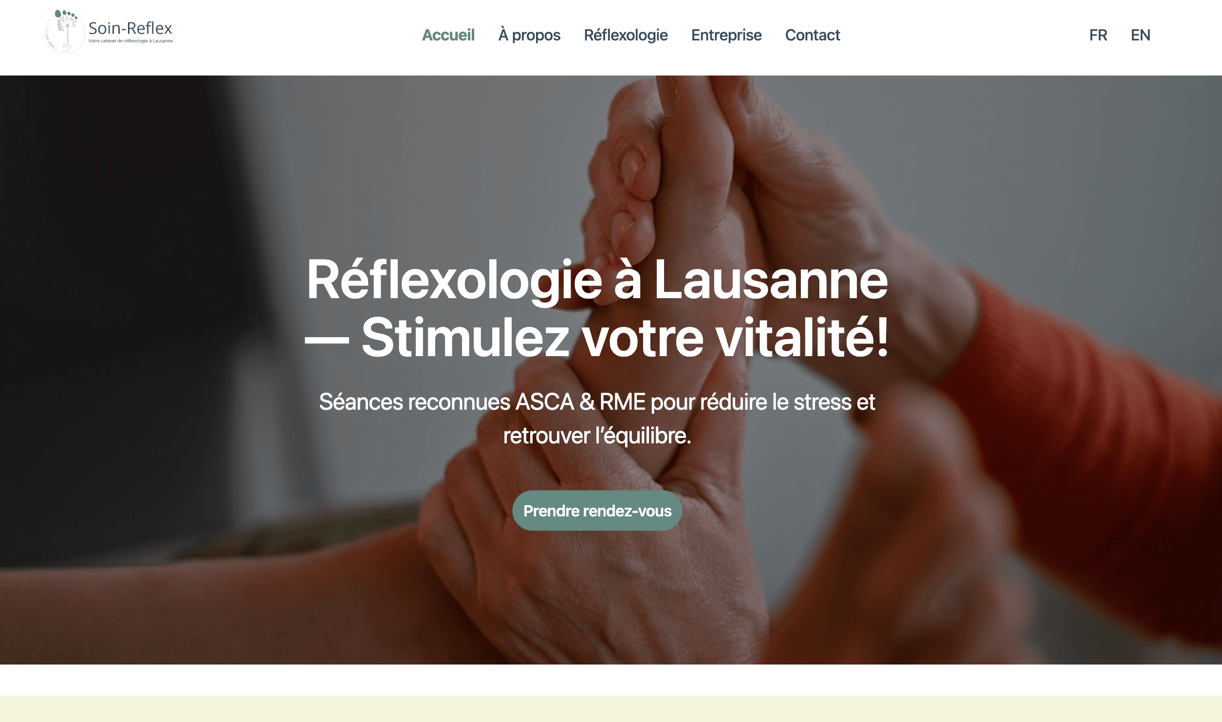
A visual identity designed to make people feel safe before they even book an appointment. The project balances therapeutic professionalism with a sense of calm, creating a reassuring experience that reflects the practice of reflexology and the human connection behind it.
THE PROCESS
The visual direction started with understanding the emotional state of potential clients: often stressed, overwhelmed, or seeking relief. Every design decision—from typography and spacing to color and imagery—was chosen to reduce visual noise and create a sense of clarity, trust, and well-being. The accreditation by ASCA and RME was integrated as a key trust-building element throughout the experience.
THE RESULT
The final experience combines a clear and professional healthcare-oriented presentation with a warm and welcoming aesthetic. The website communicates trust, highlights professional certifications, and creates a peaceful environment that encourages visitors to engage and book a session.
THE RESONANCE
The visual language evokes softness, balance, and care. Muted natural tones, generous white space, and organic imagery create an atmosphere that feels approachable and restorative. The goal was to communicate both professional credibility and emotional comfort.